This is Part 1 of a series examining techniques used in game graphics and how those techniques fail to deliver a visually appealing end result. See Part 0 for a more thorough explanation of the idea behind it.
High dynamic range. First experienced by most consumers in late 2005, with Valve’s Half Life 2: Lost Coast demo. Largely faked at the time due to technical limitations, but it laid the groundwork for something we take for granted in nearly every blockbuster title. The contemporaneous reviews were nothing short of gushing. We’ve been busy making a complete god awful mess of it ever since.
Let’s review, very quickly. In the real world, the total contrast ratio between the brightest highlights and darkest shadows during a sunny day is on the order of 1,000,000:1. We would need 20 bits of just luminance to represent those illumination ranges, before even including color in the mix. A typical DSLR can record 12-14 bits (16,000:1 in ideal conditions). A typical screen can show 8 (curved to 600:1 or so). Your eyes… well, it’s complicated. Wikipedia claims 6.5 (100:1) static. Others disagree.
Graphics programmers came up with HDR and tone mapping to solve the problem. Both film and digital cameras have this same issue, after all. They have to take enormous contrast ratios at the input, and generate sensible images at the output. So we use HDR to store the giant range for lighting computations, and tone maps to collapse the range to screen. The tone map acts as our virtual “film”, and our virtual camera is loaded with virtual film to make our virtual image. Oh, and we also throw in some eye-related effects that make no sense in cameras and don’t appear in film for good measure. Of course we do.
And now, let’s marvel in the ways it goes spectacularly wrong.


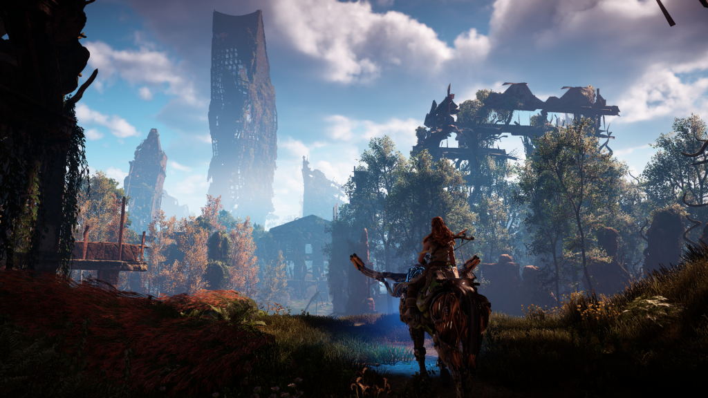
In order: Battlefield 1, Uncharted: Lost Legacy, Call of Duty: Infinite Warfare, and Horizon Zero Dawn. HZD is a particular offender in the “terrible tone map” category and it’s one I could point to all day long. And so we run head first into the problem that plagues games today and will drive this series throughout: at first glance, these are all very pretty 2017 games and there is nothing obviously wrong with the screenshots. But all of them feel videogamey and none of them would pass for a film or a photograph. Or even a reasonably good offline render. Or a painting. They are instantly recognizable as video games, because only video games try to pass off these trashy contrast curves as aesthetically pleasing. These images look like a kid was playing around in Photoshop and maxed the Contrast slider. Or maybe that kid was just dragging the Curves control around at random.
The funny thing is, this actually has happened to movies before.
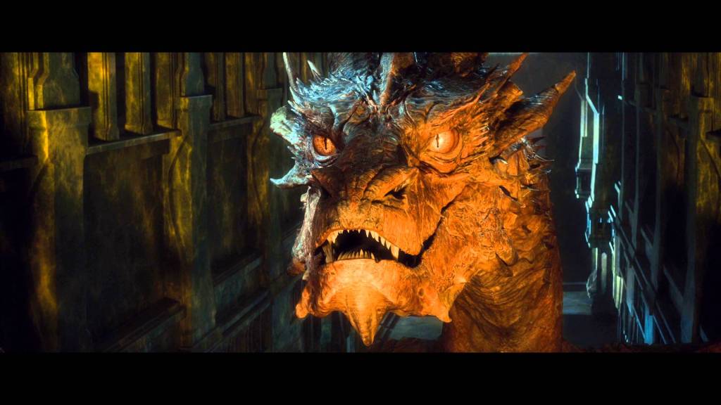
Hahaha. Look at that Smaug. He looks terrible. Not terrifying. This could be an in-game screenshot any day. Is it easy to pick on Peter Jackson’s The Hobbit? Yes, it absolutely is. But I think it serves to highlight that while technical limitations are something we absolutely struggle with in games, there is a fundamental artistic component here that is actually not that easy to get right even for film industry professionals with nearly unlimited budgets.
Allow me an aside here into the world of film production. In 2006, the founder of Oakley sunglasses decided the movie world was disingenuous in their claims of what digital cameras could and could not do, and set out to produce a new class of cinema camera with higher resolution, higher dynamic range, higher everything than the industry had and would exceed the technical capabilities of film in every regard. The RED One 4K was born, largely accomplishing its stated goals and being adopted almost immediately by one Peter Jackson. Meanwhile, a cine supply company founded in 1917 called Arri decided they don’t give a damn about resolution, and shipped the 2K Arri Alexa camera in 2010. How did it go? 2015 Oscars: Four of the five nominees in the cinematography category were photographed using the ARRI Alexa. Happy belated 100th birthday, Arri.
So what gives? Well, in the days of film there was a lot of energy expended on developing the look of a particular film stock. It’s not just chemistry; color science and artistic qualities played heavily into designing film stocks, and good directors/cinematographers would (and still do) choose particular films to get the right feel for their productions. RED focused on exceeding the technical capabilities of film, leaving the actual color rendering largely in the hands of the studio. But Arri? Arri focused on achieving the distinctive feel and visual appeal of high quality films. They better understood that even in the big budget world of motion pictures, color rendering and luminance curves are extraordinarily difficult to nail. They perfected that piece of the puzzle and it paid off for them.
Let’s bring it back to games. The reality is, the tone maps we use in games are janky, partly due to technical limitations. We’re limited to a 1D luminance response where real film produces both hue and saturation shifts. The RGB color space is a bad choice to be doing this in the first place. And because nobody in the game industry has an understanding of film chemistry, we’ve all largely settled on blindly using the same function that somebody somewhere came up with. It was Reinhard in years past, then it was Hable, now it’s ACES RRT. And it’s stop #1 on the train of Why does every game this year look exactly the goddamn same?
The craziest part is we’re now at the point of real HDR televisions showing game renders with wider input ranges. Take this NVIDIA article which sees the real problem and walks right past it. The ACES tone map is destructive to chroma. Then they post a Nikon DSLR photo of a TV in HDR mode as a proxy for how much true HDR improves the viewing experience. Which is absolutely true – but then why does the LDR photo of your TV look so much better than the LDR tone map image? There’s another tone map in this chain which nobody thought to examine: Nikon’s. They have decades of expertise in doing this. Lo and behold, their curve makes a mockery of the ACES curve used in the reference render. Wanna know why that is? It’s because the ACES RRT was never designed to be an output curve in the first place. Its primary design goal is to massage differences between cameras and lenses used in set so they match better. You’re not supposed to send it to screen! It’s a preview/baseline curve which is supposed to receive a film LUT and color grading over top of it.
“Oh, but real games do use a post process LUT color grade!” Yeah, and we screwed that up too. We don’t have the technical capability to run real film industry LUTs in the correct color spaces, we don’t have good tools to tune ours, they’re stuck doing double duty for both “filmic look” as well as color grading, the person doing it doesn’t have the training background, and it’s extraordinary what an actual trained human can do after the fact to fix these garbage colors. Is he cheating by doing per-shot color tuning that a dynamic scene can’t possibly accomplish? Yes, obviously. But are you really going to tell me that any of these scenes from any of these games look like they are well balanced in color, contrast, and overall feel?
Of course while we’re all running left, Nintendo has always had a fascinating habit of running right. I can show any number of their games for this, but Zelda: Breath of the Wild probably exemplifies it best when it comes to HDR. 
No HDR. No tone map. The bloom and volumetrics are being done entirely in LDR space. (Or possibly in 10 bit. Not sure.) Because in Nintendo’s eyes, if you can’t control the final outputs of the tone mapped render in the first place, why bother? There’s none of that awful heavy handed contrast. No crushed blacks. No randomly saturated whites in the sunset, and saturation overall stays where it belongs across the luminance range. The game doesn’t do that dynamic exposure adjustment effect that nobody actually likes. Does stylized rendering help? Sure. But you know what? Somebody would paint this. It’s artistic. It’s aesthetically pleasing. It’s balanced in its transition from light to dark tones, and the over-brightness is used tastefully without annihilating half the sky in the process.
Now I don’t think that everybody should walk away from HDR entirely. (Probably.) There’s too much other stuff we’ve committed to which requires it. But for god’s sake, we need to fix our tone maps. We need to find curves that are not so aggressively desaturating. We need curves that transition contrast better from crushed blacks to mid-tones to blown highlights. LUTs are garbage in, garbage out and they cannot be used to fix bad tone maps. We also need to switch to industry standard tools for authoring and using LUTs, so that artists have better control over what’s going on and can verify those LUTs outside of the rendering engine.
In the meantime, the industry’s heavy hitters are just going to keep releasing this kind of over-contrasty garbage.

Before I finish up, I do want to take a moment to highlight some games that I think actually handle HDR very well. First up is Resident Evil 7, which benefits from a heavily stylized look that over-emphasizes contrast by design.

That’s far too much contrast for any normal image, but because we’re dealing with a horror game it’s effective in giving the whole thing an unsettling feel that fits the setting wonderfully. The player should be uncomfortable with how the light and shadows collide. This particular scene places the jarring transition right in your face, and it’s powerful.
Next, at risk of seeming hypocritical I’m going to say Deus Ex: Mankind Divided (as well as its predecessor).
The big caveat with DX is that some scenes work really well. The daytime outdoors scenes do not. The night time or indoor scenes that fully embrace the surrealistic feeling of the world, though, are just fantastic. Somehow the weird mix of harsh blacks and glowing highlights serves to reinforce the differences between the bright and dark spots that the game is playing with thematically throughout. It’s not a coincidence that Blade Runner 2049 has many similarities. Still too much contrast though.
Lastly, I’m going to give props to Forza Horizon 3.

Let’s be honest: cars are “easy mode” for HDR. They love it. But there is a specific reason this image works so well. It is low contrast. Nearly all of it lives in the mid-tones, with only a few places wandering into deep shadow (notably the trees) and almost nothing in the bright highlights. But the image is low contrast because cars themselves tend to use a lot of black accents and dark regions which are simply not visible when you crush the blacks as we’ve seen in other games. Thus the toe section of the curve is lifted much more than we normally see. Similarly, overblown highlights mean whiting out the car in the specular reflections, which are big and pretty much always image based lighting for cars. It does no good to lose all of that detail, but the entire scene benefits from the requisite decrease in contrast. The exposure level is also noticeably lower, which actually leaves room for better mid-tone saturation. (This is also a trick used by Canon cameras, whose images you see every single day.) The whole image ends up with a much softer and more pleasant look that doesn’t carry the inherent stress we find in the images I criticized at the top. If we’re looking for an exemplar for how to HDR correctly in a non-stylized context, this is the model to go by.
Where does all this leave us? With a bunch of terrible looking games, mostly. There are a few technical changes we need to make right up front, from basic decreases in contrast to simple tweaks to the tone map to improved tools for LUT authoring. But as the Zelda and Forza screenshots demonstrate, and as the Hobbit screenshot warns us, this is not just a technical problem. Bad aesthetic choices are being made in the output stages of the engine that are then forced on the rest of the creative process. Engine devs are telling art directors that their choices in tone maps are one of three and two are legacy options. Is it bad art direction or bad graphics engineering? It’s both, and I suspect both departments are blaming the other for it. The tone map may be at the end of graphics pipeline, but in film production it’s the first choice you make. You can’t make a movie without loading film stock in the camera, and you only get to make that choice once (digital notwithstanding). Don’t treat your tone map as something to tweak around the edges when balancing the final output LUT. Don’t just take someone else’s conveniently packaged function. The tone map’s role exists at the beginning of the visual development process and it should be treated as part of the foundation for how the game will look and feel. Pay attention to the aesthetics and visual quality of the map upfront. In today’s games these qualities are an afterthought, and it shows.
UPDATE: User “vinistois” on HackerNews shared a screenshot from GTA 5 and I looked up a few others. It’s very nicely done tone mapping. Good use of mid-tones and contrast throughout with great transitions into both extremes. You won’t quite mistake it for film, I don’t think, but it’s excellent for something that is barely even a current gen product. This is proof that we can do much better from an aesthetic perspective within current technical and stylistic constraints. Heck, this screenshot isn’t even from a PC – it’s the PS4 version.

